Wednesday, November 30, 2005

Feeling Liberated

Well, I don't know about the courtyard, but I sure feel liberated after handing in the last of the sketch designs. Not sure why, as I am sure the hardest is yet to come with the masterplan. Anyway, while it is still fresh in my mind I want to post some photos of my 4th sketch design, based on the word CANOPY.
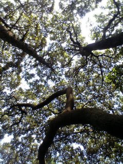

I took inspiration from a Haiku about my chosen word,

canopy
the light
dances with leaves
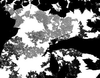


I used photos of my sketch model to explore the way light filters through a tree canopy. You can find SOLID,TRANSLUCENT and TRANSPARENT shadow and light. I took these three qualities into my design.
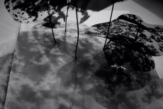
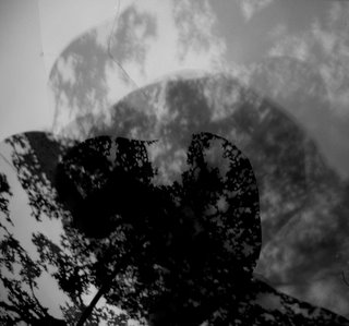


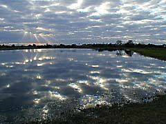
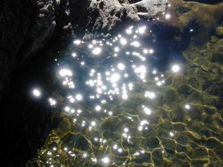
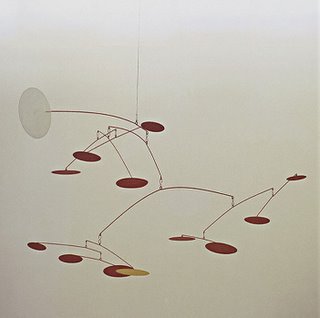
Getting light INTO the courtyard was the biggest challenge. So I used mirrors, reflective metals and water. The water is softly rippling, creating movement. The water feature is lined in a buff 'natural' colour as a black lined pool would just absorb the light. I used these two images, to keep in mind the effect I wanted to create


To make the light 'dance with the leaves' in the courtyard, I used the idea of a mobile like structure. This structure came up and out of the courtyard, connecting with the canopy of the pinus sylvestris beyond. The structure does not move freely as a mobile. The upper parts are fixed, the next level have slow, controlled movements, and the ones below that, slightly faster.


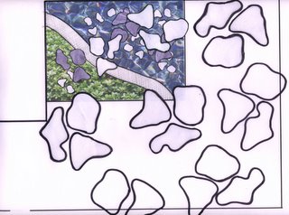
This is an unfinished plan view, but you get the gist of it. The shapes and forms are inspired by aerial views of the pinus sylvestris and also their 'platelet' like bark. I felt this design had to go beyond the courtyard, as to connect with the landscape beyond...drawing the eye up and out of the courtyard, cos lets face it looking into the canteen just aint pretty! For my 'leaves' I chose a dense ground cover plant, Pachysandra terminalis. It has so many good qualities, loves shade, tolerates frost, evergreen, lush looking...I love it!
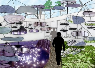


Here is my one image, of the light dancing with the leaves in the courtyard.

Saturday, November 19, 2005

Ocean Baths

Looking at Emmaslandscape a few weeks ago I followed her link to see the Leca Swimming pools in Portugal, designed by Alvaro Siza. In Australia, especially New South Wales, we have many ocean baths...and to be honest I have always taken them for granted. Like most things it's when you leave them behind that you realise how great they really are. Emmas blog inspired me to look on the web for images of my favorite ocean baths back home. They vary from small rockpools for children, to full length olympic size pools. The thing that suprised me most when looking all this up was actually how many there are in N.S.W. Over 100 pools along 1200km of coastline. I have probably been to 10 of these!

The Entrance Baths.This is one of the only listed pools, and the one I learnt to swim in. Sounds nice, but actually they used to make us tread water for 10mins, fully dressed in jumpers, jeans and shoes..in Winter! I hated every minute of it.


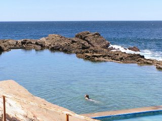
The Blue Pool, Bermagui. I love how this one has been sensitive to it's surrounding landscape


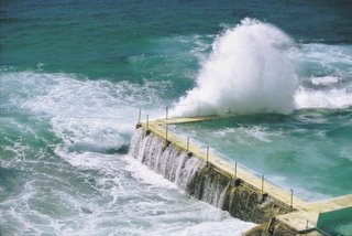
Bondi Baths. Maybe not so sensitively done, but I still love it. The surf gets so big at Bondi, that the water in the pool is constantly changed. This is the great thing about ocean baths. Sure beats the tepid, chlorine pool at my gym in London


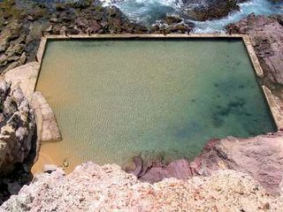
This one is located near Bega. I have not been to it, but found it on google images. I love how the rock formations are actually in the pool

Next time I am in Oz, I am going to see these pools with new eyes. I can't wait to take photos of them all!

Thursday, November 17, 2005

Getting back to Hadlow

Well, when I heard that we were doing Hadlow for our masterplan this year, I was gutted. Then I resigned myself to the fact. On Monday afternoon in our part time tutorial, I realised that maybe I wasn't quite over it as I had a bit of a moan to Jamie and Andrew about it. Anyway, after talking about it I realised that it is not that I hate Hadlow...it does have good many points, I think it is just because having spent 2.5 years going there and doing 3 assignments that related to the sites there, that I was hoping for some new ground to explore. It will be a challenge to think about Hadlow from afresh, I will just have to leave all the old baggage behind.
Anyway, Jamie reckons we won't have seen the space chosen for the sketch design. Well, we have trudged through most of the fields for ecology, traipsed through the town with Helen Armstrong, and designed gardens for planting design, so if there is some place in Hadlow that I have not seen...well I will be suprised. Oh did I mention that we planted up the raised bed in the horse stables?

Aside from that...Australia has qualified for the World Cup! Can you believe it? (no, don't answer that)

Wednesday, November 16, 2005

The Weekend

On the weekend I went to The Design Museum and Tate Modern. At the Tate I saw the Rousseau exhibition, but it wasn't my cup of tea really. Rachel Whiteread in the turbine hall was best viewed from above. Different to her other work, which I love.....this one felt a little like a warehouse full of boxes. But still very effective in the Turbine Hall. I don't think anything will ever beat the installation that Anish Kapoor did there a few years back.
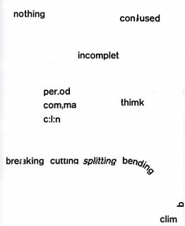
The Design Museum was great. I hadn't checked what was on, so it was a pleasant surprise. They are doing an exhibition of the graphic artist Robert Brownjohn. Well known for the credits in some James Bond films. I had no idea about him, but this guy was a genius....truly inspiring. Took way to many drugs though and died before he was 45. Here are a few photos of his work, I especially love 'watching words move'


No matter what I am doing there is always something to remind me of homework!


An installation he did for Pepsi headquarters in 1959. Made me think of my last sketch design. Just proves no ideas are original


This is from a series he did called Watching Words Move. Such a simple idea, yet how many of us could have thought of it?


Peace?

Rendered Sketches

Well, here are the same images rendered. Jamie said my images at pinup were too 'snap shot' like and that I needed to expand the view. So I have tried to do that. I quickly photshop'd in some plants. I spent about 20 minutes on this and think they look OK. Still a bit rough around the edges, but I can see that by drawing beyond the photo has improved the image.

Tuesday, November 08, 2005

Just Another Manic Monday


Well it was the usual hectic Monday madness yesterday. Including Tom Turners class in the morning, I calculated that I watched 37 presentations yesterday! No offense to any fellow students but my brain stopped absorbing at number 15. I am just grateful that I did not have to present mine at the end..it would have been like watching the living dead.
Anyway, once again I got a C+ for my sketch design. I guess I would have liked to have improved a little since my last presentation, but I completely agreed with everything on my crit sheet, so no complaints. To be honest I knew there was a lot of annotation missing...won't make the same mistake again.
Here are 2 unrendered sequential sketches that I used. Now that all I have to do this week is a powerpoint presentation, I plan to play around with them a bit more and try a few different rendering methods. I will post the results when I am done.
Adios

Sunday, November 06, 2005

Majorelle Gardens

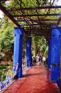
One of the things I was thinking about this week when doing this new sketch design was the duality of colour. I have used this in my concept for this project by using orange and blue, opposite colours. I suppose though that you could say that the 'duality' of a particular colour does not have to be decided using a colour wheel. Red could be the opposite of blue as one is a hot colour and one is cool. Just a thought! Anyway when I was deciding about which colours I would use, I remembered the use of colour in a garden I visited in Morocco in May, the Majorelle Gardens. Definite highlight of my trip.

Pergola with red and blue contrast


Water feature Yves Klein blue with white and acid yellow. Looks fantastic.


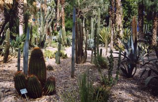
There is a duality to the planting in this garden. you go from dry, cactus garden to lush rainforest planting

Friday, November 04, 2005

'Duality' model

Here are some photos of my second conceptual model. The three key qualities I took from my first model are 'Sheltered', 'Curved' and 'Smooth'. Approaching these qualities using the theme of duality, gave me their opposites, 'Exposed', 'Straight' and 'Textured'
The photos shown here do not show all of these qualities as I am going to render them. I was explaining my ideas to my boyfriend last night, and just talking it over helped me to clarify what I am doing.....I just hope I have got the right idea about this sketch design...mine is still just a 'concept' at this point.


r

Thursday, November 03, 2005

'Duality' Sketch Design

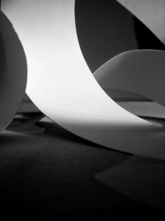
I don't think I did very well with the model making exercise. Not my forte. I must say I didn't like either of my models that I made on Monday. And I chose the easiest one to transport home on the train. However with a bit of photography I think I have brought it back from the brink of disaster, as the photos I have taken have made me see it's qualities in a different light.
I have posted a few of them here. I wrote down a list of words that sprung to mind, just like we did with the advert exercise the previous week.
I'm going to choose some of these words and think about them in terms of duality. Hopefully inspiration will spring from this process. I am not feeling very creative today......


SMOOTH, LAYERS, FOLDS,INTERSECTING, ARCHED, FRAYED, PEELING, CORNER, VIEWS, TUNNELS,

FRAGILE, SHADOW, ENCLOSED, FLAT, LOOSE, INFORMAL, CURVED, DELICATE,


HAPHAZARD, DISJOINTED
COVERED, SLOPING, ASYMMETRICAL, DISJOINTED, UNEVEN,HIDDEN,SHELTERED,CROOKED, FLIMSY, SOFT,