Feeling Liberated
Well, I don't know about the courtyard, but I sure feel liberated after handing in the last of the sketch designs. Not sure why, as I am sure the hardest is yet to come with the masterplan. Anyway, while it is still fresh in my mind I want to post some photos of my 4th sketch design, based on the word CANOPY.
 I took inspiration from a Haiku about my chosen word,
canopy
the light
dances with leaves

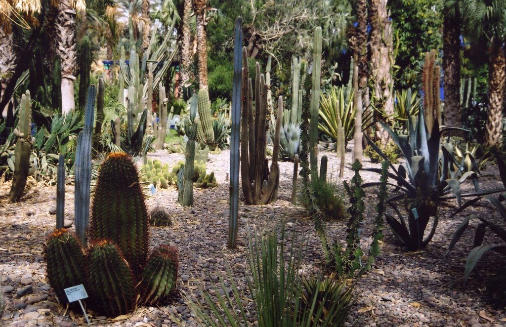
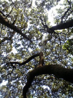
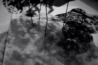
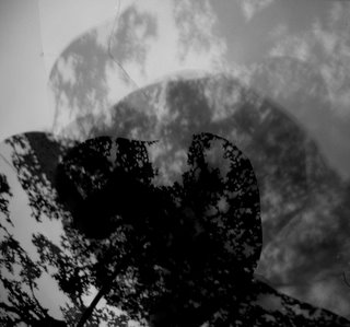
I used photos of my sketch model to explore the way light filters through a tree canopy. You can find SOLID,TRANSLUCENT and TRANSPARENT shadow and light. I took these three qualities into my design.
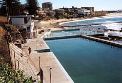
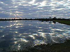
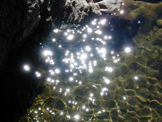
Getting light INTO the courtyard was the biggest challenge. So I used mirrors, reflective metals and water. The water is softly rippling, creating movement. The water feature is lined in a buff 'natural' colour as a black lined pool would just absorb the light. I used these two images, to keep in mind the effect I wanted to create
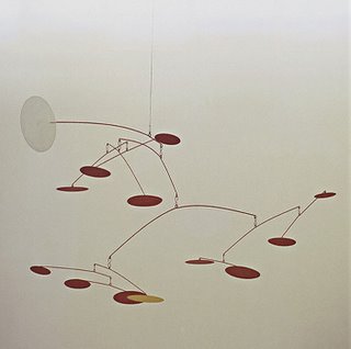
To make the light 'dance with the leaves' in the courtyard, I used the idea of a mobile like structure. This structure came up and out of the courtyard, connecting with the canopy of the pinus sylvestris beyond. The structure does not move freely as a mobile. The upper parts are fixed, the next level have slow, controlled movements, and the ones below that, slightly faster.
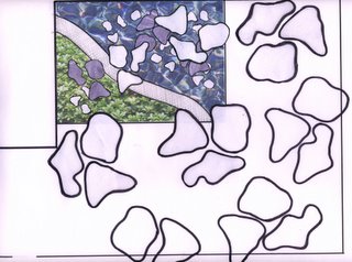
This is an unfinished plan view, but you get the gist of it. The shapes and forms are inspired by aerial views of the pinus sylvestris and also their 'platelet' like bark. I felt this design had to go beyond the courtyard, as to connect with the landscape beyond...drawing the eye up and out of the courtyard, cos lets face it looking into the canteen just aint pretty! For my 'leaves' I chose a dense ground cover plant, Pachysandra terminalis. It has so many good qualities, loves shade, tolerates frost, evergreen, lush looking...I love it!
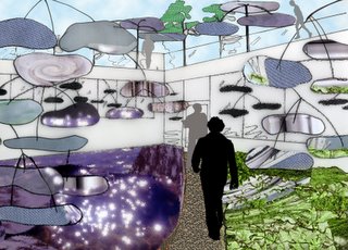
Here is my one image, of the light dancing with the leaves in the courtyard.
 I took inspiration from a Haiku about my chosen word,
canopy
the light
dances with leaves
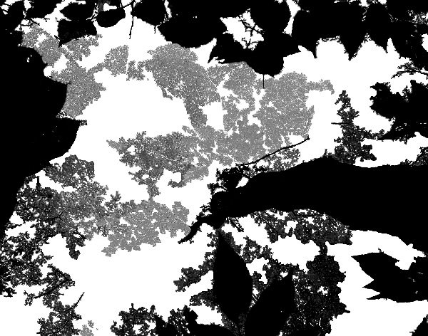
I used photos of my sketch model to explore the way light filters through a tree canopy. You can find SOLID,TRANSLUCENT and TRANSPARENT shadow and light. I took these three qualities into my design.


Getting light INTO the courtyard was the biggest challenge. So I used mirrors, reflective metals and water. The water is softly rippling, creating movement. The water feature is lined in a buff 'natural' colour as a black lined pool would just absorb the light. I used these two images, to keep in mind the effect I wanted to create


To make the light 'dance with the leaves' in the courtyard, I used the idea of a mobile like structure. This structure came up and out of the courtyard, connecting with the canopy of the pinus sylvestris beyond. The structure does not move freely as a mobile. The upper parts are fixed, the next level have slow, controlled movements, and the ones below that, slightly faster.

This is an unfinished plan view, but you get the gist of it. The shapes and forms are inspired by aerial views of the pinus sylvestris and also their 'platelet' like bark. I felt this design had to go beyond the courtyard, as to connect with the landscape beyond...drawing the eye up and out of the courtyard, cos lets face it looking into the canteen just aint pretty! For my 'leaves' I chose a dense ground cover plant, Pachysandra terminalis. It has so many good qualities, loves shade, tolerates frost, evergreen, lush looking...I love it!


Here is my one image, of the light dancing with the leaves in the courtyard.
posted by Raina at 10:20 pm
0 comments
![]()